With some help from Afloral experts and some fundamentals, you can confidently take your home's interior design into your own hands, while incorporating fake plants and artificial flowers.
The Seven Basics of Interior Design
1. Balance and SpaceAn interior decorator would first visit the space they'll be styling to understand its dimensions. Before redesigning a room, start with knowing the overall size and dimensions. Note where the doors and windows are located and plan with them in mind. In decorating, a space filled with furniture and décor is a positive space, while a place devoid of décor or furniture is a negative space.
Balancing positive and negative space is critical in creating a beautifully decorated room. The type of balance in interior design will depend on your personal preferences.
- Symmetrical Balance. One of the most straightforward ideas of balance is symmetrical design. This is a mirroring effect within a space. If you split the room down the middle, the décor and colors on one side would match the other. To further help visualize the concept of symmetrical balance, sometimes called formal balance, imagine a bed with left and right nightstands and lamps. Both nightstands and lamps are identical on either side of the bed.
- Asymmetrical Balance. A much looser approach to balance is asymmetrical interior design. A modern concept, you can replace the mirroring effect with something more flexible. Using the nightstand example, instead of matching lamps, perhaps the lights match colors, but their base shapes are different. Or maybe your living room has two lounging areas. One is a couch, and the other is two chairs or a loveseat.
- Radial Balance. This is a more complex interior design, where it begins and requires establishing a natural focal point—a mirror, a hearth, a chair—and then decorating with smaller pieces around the focal point. A great example is decorating a room with a fireplace or hearth and carefully arranging décor or furniture items to face toward it. Adding garland to a fireplace also anchors the focal point, during the holiday anchor it with a christmas garland.

2. Unity
You want your room to have a cohesive theme whether you choose that theme to be matching materials such as all neutral wood hues, the exact furniture sizes, a matching color scheme, as found in our fall foliage collection, or a harmony between the shapes of décor selected for a room.

3. Rhythm
What does interior design mean when they mention a room with rhythm? It's not musical. Instead, it's the use of decorative repetition. What does that mean? It means repeating a décor touch. Perhaps everything in the room is circular. Maybe the cabinet handles in the kitchen and bathroom match, or you choose a single finish for all tapware in your home, such as all brushed brass, matte black, or white. Another example of rhythm would be having similar furniture styles and wood colors in the kitchen, dining room, and living room.

4. Proportions
A line brings structure and a sense of direction. There are three lines to consider when designing, horizontal, vertical, and dynamic. Horizontal lines are easily found in tables and chairs, while vertical lines often come from doors, windows, and tall pieces like bookshelves. Dynamic lines invite action, such as a staircase.
How do the objects you have placed or will place in your room fit into these lines? The size of the space you are working in chiefly determines this. Large, chunky furniture would look stunning in a large room with high ceilings. A small room, however, would look cluttered and even smaller with large furniture.
Lines and proportions can tell you how well items will fit together in a space. You want to create a spatially pleasing balance or groups by grouping by size, shape, texture, or color elements. Try displaying our large artificial branches to complete the look. Try our fall branches throughout the seasons.

5. Contrast
Adding one or two pieces that contrast is an excellent means to add a bit of intrigue and interest to a space that may feel mundane. There are many means to create alluring contrast in any room, whether placing a square piece in a room of all rounded shapes and corners, a contrasting material, color, or texture.
Think of polar opposites when considering a contrasting element. Perhaps you have painted your living room a soothing grey, and all wood furniture has a neutral light tone. Adding a bright, vivid color in the form of pillows to the couch adds a unique pop of contrast and interest. Or consider a bedroom with light furniture against a very dark painted wall, rough materials against smooth, etc.
6. Emphasis
What do you want the focal point of the room to be? In the bedroom, it might be the bed in the dining room. It is probably the dining room table. Creating emphasis encourages you, your family, and guests to gather around the focal point and draw traffic to the space.
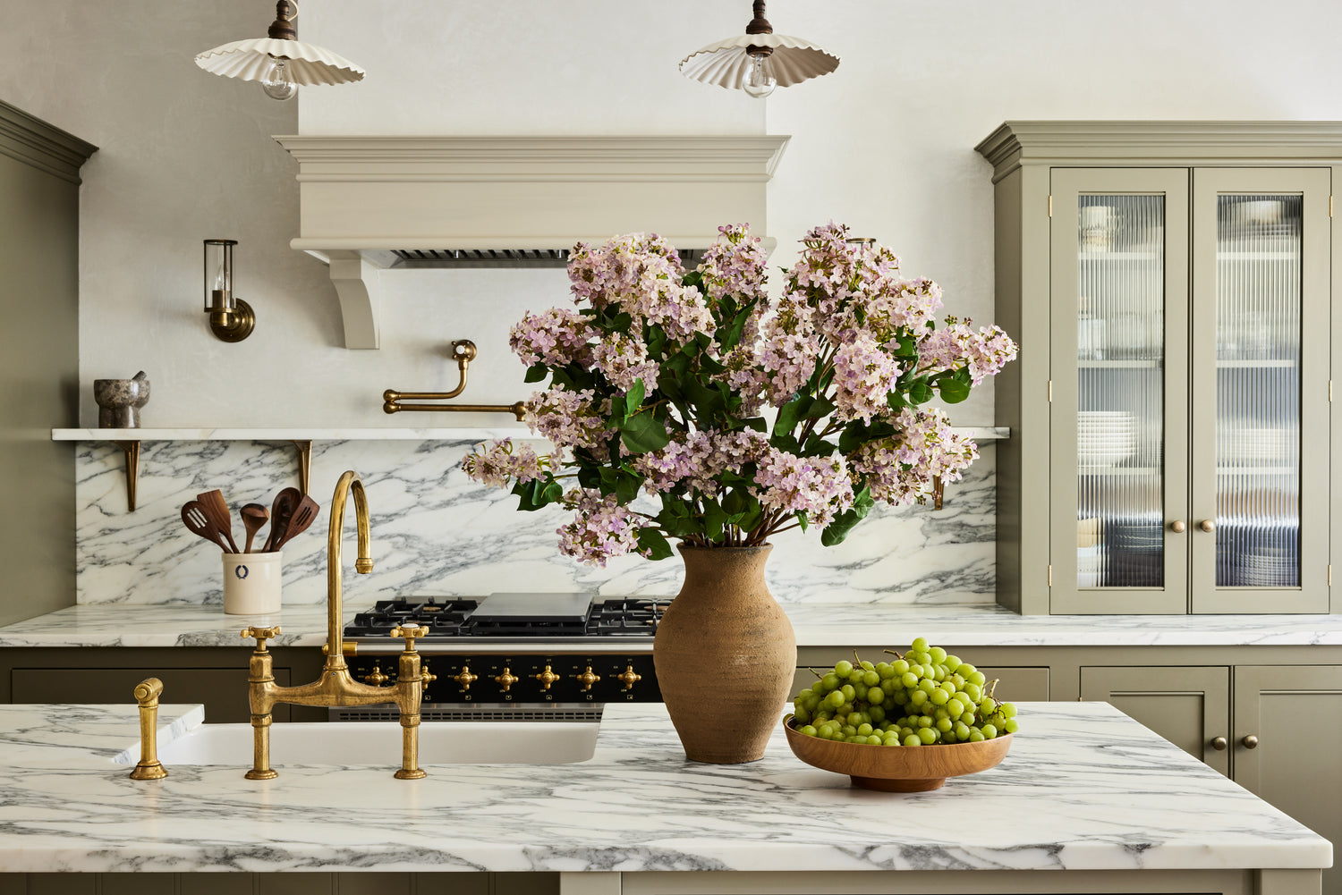
Your emphasis can be whichever you desire. Perhaps it is an evocative piece of art, a hearth, a colorful throw over a couch, or a bold backsplash in your kitchen. You can emphasize your space, from alluring décor to beautiful, bold florals.
7. Details
Finally, the last principle is being able to pay attention to details. Sometimes, the little details can take a room from alright to outstanding. A flawlessly arranged bouquet, attractive embroidery on fabrics, the style and color of your cabinetry pulls or knobs, and even the accessories in the bathroom, such as a soap dispenser—all of these little details elevate a space into something beautiful.

Basics of Color Theory
What is color theory all about, anyway? Its basic form involves understanding how colors interact and how they can create a harmonious composition. Understanding color theory can help with interior design basics such as contrasts, unity, and emphasis.
The color theory uses various principles such as hue, value, intensity, and temperature to harmonize colors. By combining different tints, shades, and hues of a single color or mixing multiple colors, interior designs can create effects that evoke emotion or convey a message.
The color wheel is one of the best tools to help you design and understand color theory. Many color wheels and tools are quickly found online to help you visualize colors and how they interact.
A color wheel consists of the following:
• Primary colors. Red, yellow, and blue are the primary colors that cannot be replicated by mixing other colors
• Secondary colors. Secondary colors are created by mixing red, yellow, and blue together. Orange, green, and purple are secondary colors
• Tertiary colors. When you mix a primary color, like red, into a secondary color, like purple, to create a different shade of purple, that other shade of purple becomes a tertiary color
• Complementary colors. These two colors sit opposite or across from one another on the color wheel, creating a sharp contrast in interior design. For example, red and blue, red and green, yellow and purple—these colors are complementary
• Split Complementary colors. Similar to complementary colors, split complementary also mixes hues from either side of its complement. For example, orange, yellow, and blue are split complementary color
• Analogous Colors. Analogous colors sit side by side on the color wheel, creating a pleasant atmosphere in design. Red and purple, blue and green, for example, are analogous colors
• Monochrome colors. One single color but in various tints and hues. For instance, if you want to create a calming atmosphere, a space with all different kinds of blues is a monochrome design color. Explore our monochrome artificial flower arrangements.

• Neutral colors. White, black, grey, beige, and brown are neutral colors that can easily match any other accent in a room that perhaps already filled with a colorful palette

Color temperature
Cool hues, such as blues and greens, create a calming space, while warm colors, like reds, oranges, and yellow, are energetic, warm shades. A neutral shade like beige or grey will balance the two extremes of cool or warm colors.
To create visually stunning contrasts, you can combine different temperature colors, such as pairing an excellent color with warmer, or complementary colors like pink and green, for example, adding vibrancy to any space.

Emotional Response
Colors have a profound effect on our moods and emotions. When choosing a color for a space, it is essential to think about what that space will be used for. For example, if you want to create a calming, relaxing bedroom, then you might want to consider calming colors such as blues and greens. If you want an energetic feel to a workout room or kitchen, choose red which presents passion and excitement, or yellow, which increases optimism and brightens.
Tips for Color Choice:
1. Use the color wheel and color wheel tools.
2. Understand tints and shades.
3. Pick colors carefully and with thoughts on the effect you wish in the room.
4. Use monochromatic colors for a balanced effect.
5. Balance primary and secondary colors for a visually appealing composition.
6. Think about the proportions of color. Too much of a single shade can be overwhelming, so decide on how much or how little of a particular color you will use in your design.
7. Consider the space's lighting effects. Artificial lighting can alter natural hues in home decorating. Too dark of a shade in a low-light area may create a sense of less space.
8. Don't forget to add neutral colors. Whether those neutral tones come from modern all-black furniture such as tables and chairs or natural shades of brown from wood accents, add these shades to your interior décor accents and accessories.
9. 60-30-10 decorating rule. This guideline suggests that the most accessible means of understanding how many colors should be used is the 60-30-10 rule. 60% of the room should have one dominant color, 30% a secondary color, and 10% an accent or contrasting color.
With these basics kept in mind and with time, patience, and color wheel experimentation, you are well underway to understand the basics of interior design and color theory to create the home or room of your dreams. Merging interior design basics and color theory will become an invaluable resource in your home design and help create an ideal space.